
Most business owners think about their website in terms of colors, logos, photos, and layout. Typography — the fonts you choose and how you use them — rarely makes the list of things people consciously think about. But here is the truth: typography is doing more work on your website than almost any other design element, and when it is done wrong visitors feel it even if they cannot explain why.
What Typography Actually Is
Typography is not just picking a font you like. It is the complete system of how text is presented on your website — the typefaces you choose, the sizes you assign to different levels of content, the spacing between lines and letters, the weight and color of different text elements, and the hierarchy that guides a visitor's eye from the most important information to the least important.
Done well, typography is invisible. Visitors simply flow through your content naturally without thinking about it. Done poorly, typography creates friction — text that is hard to read, pages that feel visually chaotic, headings that do not stand out from body text, content that feels like a wall of words with no clear entry point.
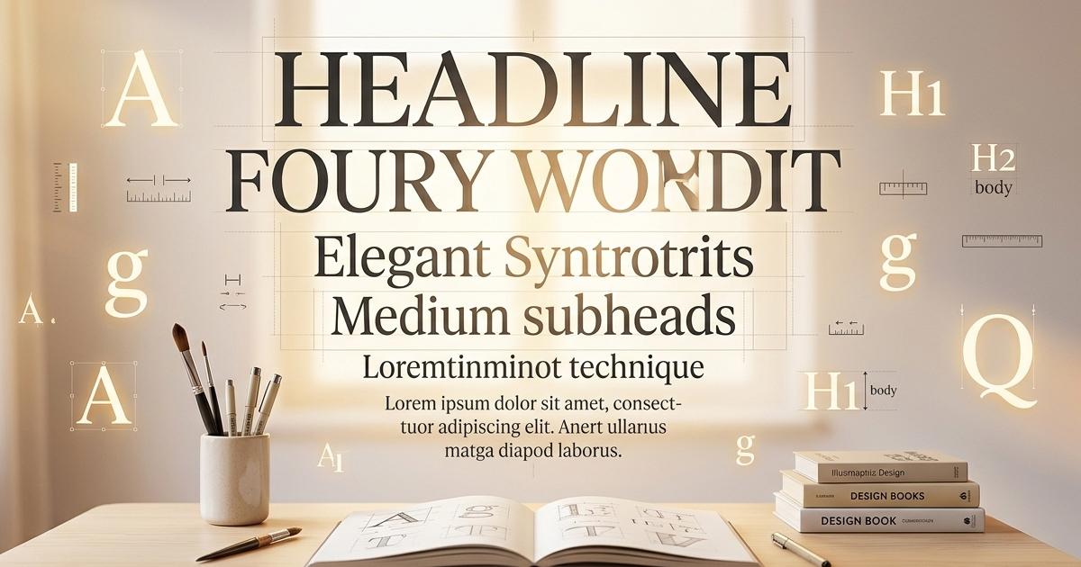
The Hierarchy Problem
The most common typography mistake on business websites is a lack of clear visual hierarchy. Hierarchy is the system that tells a visitor at a glance what is most important on a page, what is supporting information, and what is detail. It is communicated through size, weight, color, and spacing.
Your H1 is the headline — the single most important statement on the page. It should be large, bold, and impossible to miss. Your H2s are section headers that break the content into digestible chunks. Your H3s are sub-points within those sections. Your paragraph text is the body — readable, comfortable, and not competing with anything above it. Your links should be visually distinct from surrounding text so visitors know they are clickable. Your bullet points should create visual breathing room that makes lists scannable rather than dense.
When all of these elements look too similar — when the H1 is only slightly larger than the H2 which is only slightly larger than the body text — the page loses its visual structure and becomes harder to read and navigate. Visitors scan before they read and if the scan does not reveal a clear structure they leave.
How Font Choice Affects Perception
Different typefaces carry different psychological associations that affect how visitors perceive your brand before they read a single word of your content. A law firm using a playful rounded sans-serif font creates cognitive dissonance — the visual message contradicts the professional credibility the firm is trying to project. A children's toy store using a stern serif font feels cold and unwelcoming.
Broadly speaking serif fonts — the ones with the small decorative strokes at the ends of letters — feel traditional, authoritative, and established. Sans-serif fonts — clean lines with no decorative strokes — feel modern, approachable, and efficient. Display and decorative fonts make strong visual statements but should be used sparingly for headlines only, never for body text. Monospace fonts have a technical, code-like feel that works well for tech companies but feels out of place for a florist.
Most professional websites use one or two fonts — one for headlines and one for body text — chosen to complement each other and reinforce the brand's personality. More than two fonts on a single page almost always creates visual noise.
Readability Is Not Optional
A font can be beautiful and completely unreadable at the same time. Script fonts that look elegant in a logo become exhausting to read in paragraph form. Very thin font weights disappear against light backgrounds. Very tight letter spacing makes text feel claustrophobic. Very small font sizes force visitors to lean in or zoom their browser.
Readability is not just an aesthetic consideration — it directly affects how long visitors stay on your page and how much of your content they actually consume. Google measures engagement signals like time on page and bounce rate as part of how it evaluates your website. A beautiful but unreadable website is quietly hurting your search rankings in addition to frustrating your visitors.
Line height — the space between lines of text — is one of the most overlooked readability factors. Text that is too tightly spaced feels dense and difficult to read. The standard recommendation for body text is a line height of 1.5 to 1.7 times the font size. That extra breathing room makes paragraphs dramatically more comfortable to read without making the page feel empty.
How To Build Your Typography System The Right Way
Here is how we approach typography on every website we build at OrbiByte — and it is a method any developer or designer can use.
Before writing a single line of CSS for the actual pages, create a dedicated typography test page on the site. Put every text element on that page — H1, H2, H3, H4, paragraph text, links in context, bold text, italic text, bullet point lists, numbered lists, blockquotes, and any other text element the site will use. This page becomes your living style guide.
Then define all of those elements in your global stylesheet. Not on individual pages. Not as inline styles. In the master CSS that applies to every page on the site. This means every page automatically inherits the correct typography without you having to think about it again. When you add a new page three months from now it will look typographically consistent with every other page on the site without any additional work.
The advantage of this approach is consistency. Every heading across every page will be the same size, weight, and color. Every paragraph will have the same line height and font size. Every link will look the same. Your site feels like a coherent designed system rather than a collection of individual pages built at different times by different people.
This is exactly how Joe CMS handles typography — global styles defined at the theme level that cascade across every page automatically. Change the H1 definition once and every H1 on every page updates instantly. It is the difference between a design system and a patchwork.
The Mobile Factor
Typography that works beautifully on a desktop can fall apart completely on a mobile device. Headlines that looked appropriately dramatic at sixty pixels become overwhelming on a four inch screen. Body text that was comfortable at sixteen pixels may need adjustment for small screens. Line lengths that worked perfectly in a wide desktop layout become awkward when the page collapses to a single column.
Responsive typography — font sizes, weights, and spacing that adapt intelligently to the screen size — is not a nice to have. It is a requirement. More than half of your website visitors are on mobile devices and if your typography does not work for them your content does not work for them.
The Bottom Line
Typography is not decoration. It is communication infrastructure. It determines whether your content is readable, whether your visual hierarchy guides visitors through your pages effectively, and whether your brand personality is reinforced or contradicted by the fonts you chose. It affects engagement, bounce rate, and ultimately search rankings.
The businesses with websites that feel effortlessly professional — where you cannot quite put your finger on why everything looks so right — almost always have strong typography systems underneath. It is the quiet foundation that makes everything else work.
If you are building a new website or evaluating your existing one, look at your typography as a system. Does your H1 immediately command attention? Can visitors scan your pages and understand the structure in seconds? Is your body text comfortable to read for more than thirty seconds? Is it consistent across every page? If the answer to any of those is no, you have found one of the fastest improvements you can make to how your website performs.
📞 (239) 471-9213 🌐 orbibyte.com/contact-us
